Client Work: Megan’s Piano Lessons
I recently had the opportunity to work with a small business owner to spruce up the branding of her piano lesson’s business and supporting blog. I really enjoy working with small businesses, and the fact that I have known the owner, Megan, for years made the project even more enjoyable!
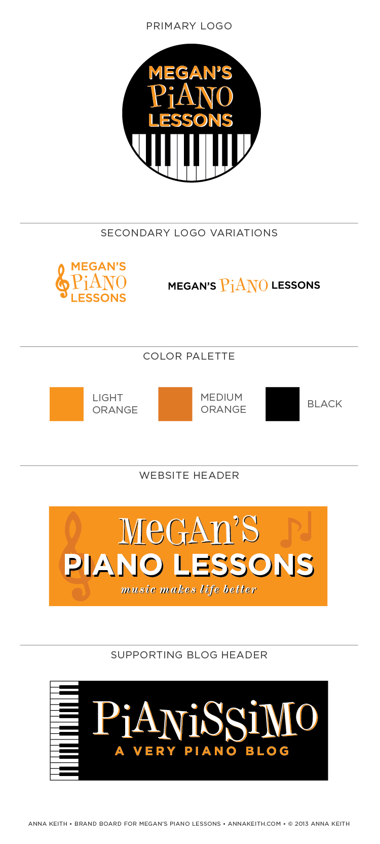
Megan initially reached out to me about creating a blog header for Pianissimo, a blog she was launching about her love of the piano and piano education. At that time, she had a different logo and website header for her primary site, meganspianolessons.com. (She had created those graphics herself.) As the scope of work was initially just the Pianissimo header, my challenge was the create something that blended with her current branding. She wanted it to be primarily black and white, with a touch of orange, and for it to be both clean and cheerful. After I presented Megan with a couple options, she selected the header and was excited to put it up on her site.
A few weeks later, she approached me again about updating the header and logo for meganspianolessons.com. She wanted it to make the sites more visually cohesive. So, using the Pianissimo header and the color palette of black, white and orange as a jumping off point, I worked with her to create the logo and primary blog header. You can see the final results below!


Leave a Reply
Want to join the discussion?Feel free to contribute!