Vector vs. Raster: What is the difference?

Not too long ago I had a client ask me how to tell the difference between vector and raster files. She’d heard the terms plenty of times, but didn’t actually know what it meant. So in case you’ve been wondering too, here is the scoop:

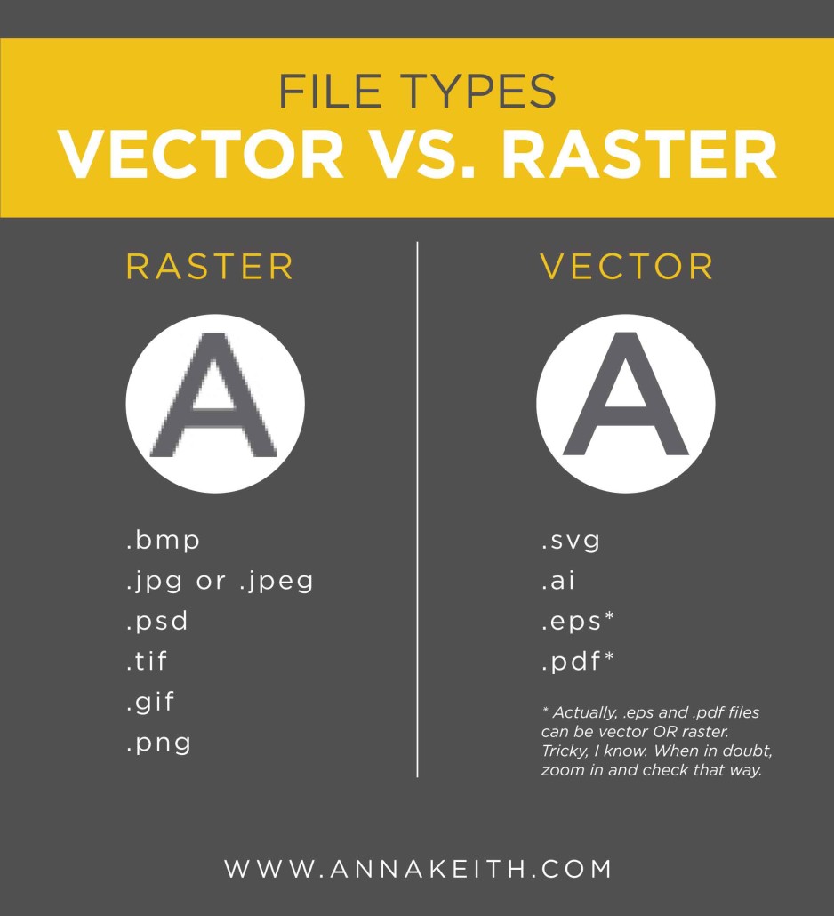
A raster file is made up of pixels – hopefully hundreds or thousands of them. Each pixel is a different color.

A vector file, on the other hand, is made of lines and curves.

So why does it matter? It matters when you try to print or view your file at a larger size. A raster file has a finite number of pixels, so if you try to print that file at a significantly larger size, you are going to start to see those individual pixels (aka, the image will be pixelated). A vector file, meanwhile, can scale up without any issues. It actually uses mathematical formulas (yuck!) to retain a sharp and crisp appearance at any size.

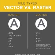
How do you know if your file is vector or raster? Here’s a handy list to help you out.
Vector vs. Raster

JTT isn’t dead. And neither is print.

The other day, I saw a story about how Jonathan Taylor Thomas is over 30. I saw his name and thought to myself, oh yeah, I remember that guy. So, he isn’t dead…. but no one is talking about him anymore.

jonathantaylorthomas

You’ve probably heard someone say print is dead. But guys, it isn’t. Print is like Jonathan Taylor Thomas. Its just that no one talks about it anymore.

I think people say (and possibly think) that print is dead because they are so excited by new technology and the rapid changes in digital design and marketing. But just because there are new and exciting opportunities to market your brand doesn’t mean that some of the old tried and true techniques are no longer effective. In fact, I’d argue the opposite – in a marketing landscape with so many new and exciting ideas, its important to have a good foundation for your brand, which includes some print. Customers know that anyone can throw up a website in an afternoon or sign up for a Twitter account. But, a brochure or catalog, or even a business card, requires more commitment and more effort. It shows that your business isn’t fleeting.

So when building a multichannel marketing plan, don’t forget about print! It isn’t dead. And neither is our favorite 90s hearthrob, Jonathan Taylor Thomas.

If you could use some help getting some print (or digital) marketing materials created for your brand, send me an email at anna@annakeith.com. I’d love to help you out!

Print Isn't Dead

Yes, Design Matters.

Yes, design matters.

To start, well-designed branding communicates professionalism and credibility before you even say ANYTHING. Why put yourself behind the gun before you even open your mouth?

Once you’ve got the attention of your audience, design can keep your customer engaged for longer. If your company brochure or sales presentation is just lots of text, I can pretty much guarantee that less people will read it all the way through, if anyone. A well-designed piece engages your audience and makes them stick around to see what you are trying to tell them.

Over time, consistent branding makes your business stand out. By establishing a clear visual language for your brand and implementing it across all your marketing channels, your customer will know that brochure comes from you, just like that mailer they got last week and that infographic from twitter they saw yesterday. If each of those pieces look different, it will be harder for your customer to connect that they all came from you. And of course, you want them to remember your company, as opposed to confusing you with your competition.

Once you’ve made a sale, good design is a part of good customer service. A great welcome packet to onboard new clients, as an example, gives them clear understanding of what’s next and helps them feeling well taken care of. Or it might even be something as simple making sure your website makes it clear how to contact someone if your client has more questions.

So did I convince you, blog reader, that design matters? I hope so. Consistent branding shows professionalism and credibility, engages your audience, helps your business stand out from the competition and helps your customer feel cared for. And why wouldn’t you want that?

DesignMatters

Why I don’t like to hear that you’ll “write to fit” my design.

From time to time, I’ll have a client request that I create them a template and then they will “write to fit” whatever I design. You might think a designer would be excited to hear this, but I’m not. Designing first and then writing to fit feels backwards to me.

The way I see it, design is a tool to help communicate to an audience. Yes, design will make content more visually appealing, but it should also do more – it should help make the content easier to understand. The content drives the entire design. That is why starting with the design feels backward. If I don’t know exactly what is being said, how can I best help communicate it?

Read more

Yes, your data can be an infographic.

In the past couple years, infographics have exploded all over the web.

But they’ve been around long before that. Infographics are simply visual representations of data. That includes everything from maps to graphs to the weather icons you see in the newspaper.

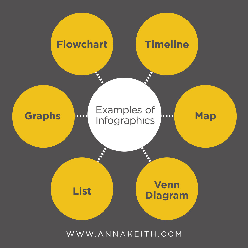
So can your data be an infographic? Yes, the answer is always going to be yes. If you’ve got information to share, you can represent it visually. Here are just a few of the possibilities:

Infographics-01


  • Pie graphs or line graphs are great for when you’ve got numbers, like percentage breakdowns or other growth.
  • A flowchart is often used to answer a question by giving the reader choices.
  • A timeline is used to display chronological data.
  • A map shows locations.
  • A venn diagram or charts shows a comparison.
  • A list can be used for tips or a step-by-step.

Even if your data doesn’t seem to perfectly fit into one of the examples above, you can still present it visually. It’s called a visualized article, and you use combinations of icons, illustrations or images to break and article into easily understood information. Since the brain processes images faster than text, getting your point across ASAP is ideal.

Here are a few infographics I’ve created for clients. If you’d like to work together on an infographic project, send me an email to learn more at anna@annakeith.com.


This slideshow requires JavaScript.