Design Speak: Press Check

I realize that sometimes it seems like graphic designers (and printers) have their own language. I’ve started the Design Speak series here on my blog so I can help clarify some of these terms you may hear, but not totally understand. 

Has your printer ever asked you if you want to do a press check? And maybe you weren’t sure what they were even asking?!? Here’s the scoop.

A press check is usually done at your printer’s facility. It’s a chance for you to stop by and give your project one final look once it is all set up and ready to print. Now, it’s not the time for text edits or other proofreading changes. It is the time for you to look at the color and the paper, and make sure everything is printing as expected. Since each printer is a bit different and each computer screen is different, it can sometimes be really nice to be able to see how the colors look on the paper you’ve selected. Usually I’m looking to make sure skin tones look true to life, that the brand colors are printing accurately and that everything just looks as expected. If you’re investing in printing, it’s nice to make sure everything is just how you want!

 

Design Speak: Hi Res and Low Res

I realize that sometimes it seems like graphic designers (and printers) have their own language. I’ve started the Design Speak series here on my blog so I can help clarify some of these terms you may hear, but not totally understand. 

The terms hi res and low res are used to describe photos, but admittedly they can be confusing. So let’s break it down.

Hi res is short for high resolution. Low res is low resolution. Each and every photo you see, if you zoom in really closely, is made of tiny squares (pixels). High resolution images are 300 or more pixels per inch. That is the size preferred for printing. Low resolution images less than that, often 72 pixels per inch, and are better suited to be viewed online.

Here’s where it gets a little tricky. I was working with a client recently and the photos they sent to me were 300 pixels per inch, but they were still small, so I asked for bigger images. They were understandably confused because they were just looking and saw its 300 pixels per inch, and so figured it would be suitable for printing. The problem was, the overall number of pixels was low. If the entire image is only 450 pixels by 600 pixels, that’s only 1.5 inches by 2 inches at 300 pixels per inch. So while it is a high resolution photo, it can still be small image.

So make sure that when you are looking for high resolution images, you also check the total number of pixels. That is a really important piece of information when determining if a photo is fit to print.


Pantone or PMS colors

Design Speak: Pantone colors

I realize that sometimes it seems like graphic designers (and printers) have their own language. I’ve started the Design Speak series here on my blog so I can help clarify some of these terms you may hear, but not totally understand.

Pantone started out as a printing company in the 1950s, and nowadays when you think about Pantone or hear the term, you think about colors. There’s always a Pantone Color of the Year or your brand might have Pantone numbers (like PMS 102) associated with your main colors. So what is it, really?

PMS stands for Pantone Matching System. Pantone colors are standardized ink colors you use to ensure the color is consistent at all times. Normally, when you print something on a standard printer the colors you see are a combination of 4 standard inks: Cyan, Magenta, Yellow and Black. Printers can vary a bit, so Pantone colors make sure your brand color is consistent every time.

That said, sometimes it isn’t cost effective (or possible!) to print with your Pantone, but its still helpful to know it. Each Pantone is associated with a CMYK breakdown and RGB breakdown, so identifying you color as a specific Pantone has just become the way colors are often defined in the graphic design, marketing or advertising industries.

Pantone or PMS colors

DesignSpeak-Pantones-01

Design Speak: Kerning and Leading

I realize that sometimes it seems like graphic designers (and printers) have their own language. I’ve started the Design Speak series here on my blog so I can help clarify some of these terms you may hear, but not totally understand. 

Today we are talking about: Kerning and Leading.

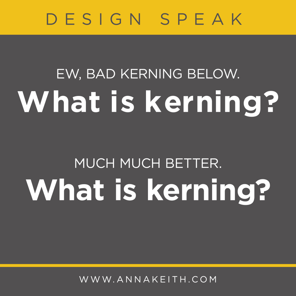
Kerning is the space between individual characters in a single word.

What is Kerning?


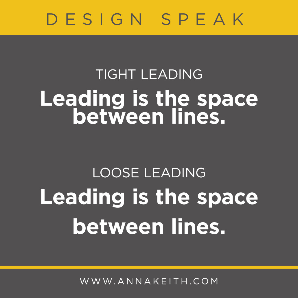
Leading is the space between the lines of words.

Leading is the space between lines.

For whatever reason, when I was in school I used to mix these terms up. The way I got myself to remember is that leading is lines, and both of those words start with an L. Kerning, meanwhile, is characters. And while kerning and characters they don’t start with the same letter, they sound like the do, so it still works.


Design Speak - Type As Outlines

Design Speak: Type as Outlines

I realize that sometimes it seems like graphic designers (and printers) have their own language. I’ve started the Design Speak series here on my blog so I can help clarify some of these terms you may hear, but not totally understand. 

Today we’re talking about a phrase designers and printers might say from time to time. Drumroll please…. type as outlines! (I guess I spoiled that in the headline.) You may also hear people say fonts as outlines. This is the same thing.

If you convert your type (or fonts) to outlines, it basically takes all the text and makes it a graphic instead. So rather than being a font, each character is now an individual shape.

The great thing about this is that if you use a font not available on all computers, and then send the file to a printer or another computer that doesn’t have that font, the recipient will still see the graphic as it looked for you and be able to print it. (Worth noting that some file types and software programs embed fonts, so it won’t matter. But some design and printing software does not, which is why designers and printers run into this issue.)

So why don’t designers just save every document with type as outlines? The downside is that since the text is converted to outlines, it is not a font anymore, and it is very difficult to make changes to the text.


Design Speak - Type As Outlines

Design Speak: Serif and Sans Serif

I realize that sometimes it seems like graphic designers (and printers) have their own language. I’ve started the Design Speak series here on my blog so I can help clarify some of these terms you may hear, but not totally understand.

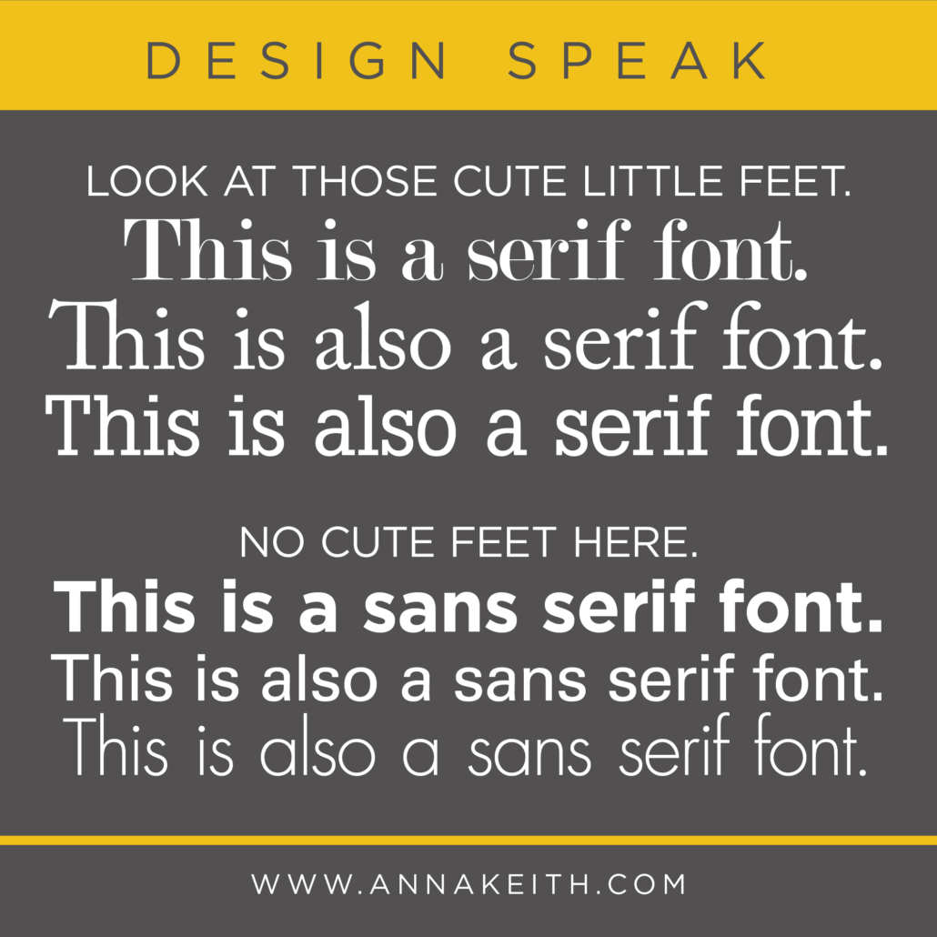
Basically, serif fonts have serifs. Sans serif fonts don’t have serifs. But you might of been able to guess that part. So, what is a serif?

A serif is the little lines at the ends of individual characters. Sometimes people refer to them as little feet, which seems cute.


Serifs are considered decorative, but historically also served a function – serif typefaces were thought to be easier to read because those cute little serif feet helped the eye travel across a line of text. This is why you often see serifs in books or as the body copy for newspapers. On the flip side though, serifs can make it harder to read text when its pretty small. All in all, because we have so many fonts to choose from these days, there are plenty of sans serifs that are easy to read, and especially when designing for kids, sans serifs are ideal, because the characters are generally less complex and easier to recognize for new readers.

When picking a font, you want to consider readability (of course!) but also what kind of attitude and vibe it has. Generally, serifs are seen as more traditional and sans serifs may seem more modern, but again, with the wide variety of fonts available these days, that doesn’t always hold true.