Why I don’t like to hear that you’ll “write to fit” my design.

From time to time, I’ll have a client request that I create them a template and then they will “write to fit” whatever I design. You might think a designer would be excited to hear this, but I’m not. Designing first and then writing to fit feels backwards to me.

The way I see it, design is a tool to help communicate to an audience. Yes, design will make content more visually appealing, but it should also do more – it should help make the content easier to understand. The content drives the entire design. That is why starting with the design feels backward. If I don’t know exactly what is being said, how can I best help communicate it?
Read more

Awards from #FCA2016

Warning: Not so humble brag below…

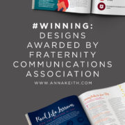
I’m very excited to share that some of my work created for Pi Beta Phi’s quarterly magazine, The Arrow, was awarded at the 2016 Fraternity Communications Association (FCA) Annual Conference. They submitted two features I had designed for them. The first, about philanthropy, was awarded second place for design of a feature article. The second, a feature on real life lessons, won first place for story packaging for a feature article (meaning the best of both and design). I’m so pleased and honored to have the stories honored, and congrats to the Pi Beta Phi team, led by editor Constance Gibbs!

You can see the 2 features below.

This slideshow requires JavaScript.

Turn Timeline

Client work: TransStates Turn Timeline

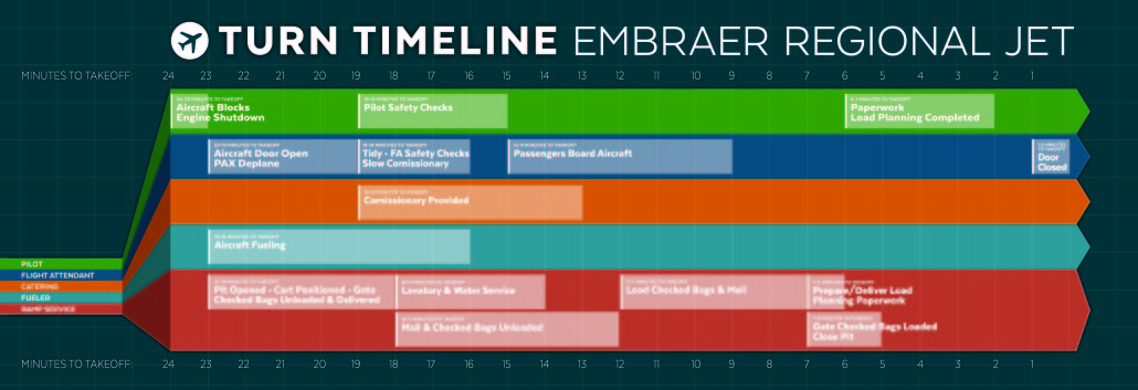
I’ve been helping out the marketing team at TransStates airlines for about 6 months. TransStates flies on behalf of United Airlines (as United Express) and American Airlines (as American Eagle), so while I didn’t realize it at the time, I’m sure I have (and maybe you have!) been a passenger on one of their flights. Since we starting working together, I’ve helped them with design for everything from web banners to photo editing to brochures, and just recently wrapped up the Turn Timeline, an infographic poster.

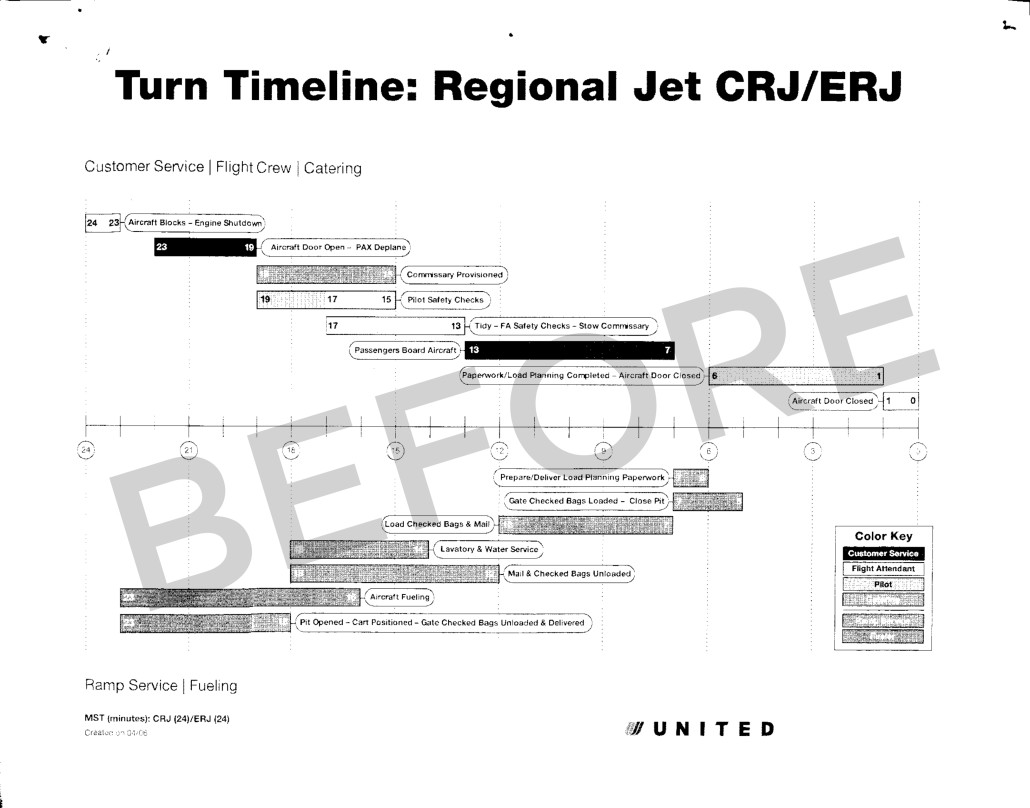
The poster illustrates the roles and responsibilities of different staff members during the 24 minutes a flight is at the airport. The previous version was in black and white and it wasn’t user friendly. (You can see it below.) I used color coding and separate rows to make it clear which crew member was responsible for which task, and when each crew member had a break. Additionally, the colorful piece is now much more eye-catching, as opposed to the before version.

The Turn Timeline is used for both American Airline and United Airline flights, so we intentionally didn’t use the logo and branding from either one. The poster will be displayed in crew areas so it can be easily referenced on the go.

Turn Timeline Before

Turn Timeline Before

Turn Timeline

Turn Timeline for TransStates Airlines – the final design.

The Consortium for Graduate Study in Management FY 2015 Annual Report Cover

Client work: The Consortium for Graduate Study in Management

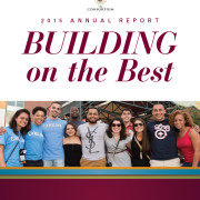
I got a chance to team up with The Consortium for Graduate Study in Management this fall for a couple fun projects. The organization is an alliance of leading American business schools and businesses, working together to enhance diversity in business education and in corporate leadership.

One of the projects we just finished up was the design their 2015 Annual Report. It celebrates their biggest accomplishments in FY2015 and includes a list of their donors. Initially it was planned to be a primary online piece, but they ended up choosing to print some copies as well. You can see some of the pages below.

This slideshow requires JavaScript.

WUSTL Spring 2016 Course Catalog Cover

Client work: WUSTL Course Catalog

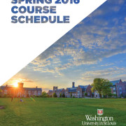
I recently teamed up with the WUSTL University College staff to help them with their Spring 2016 Course Catalog. For years, this piece was a boring, black and white catalog printed on newsprint. As University College is primarily adult learners and continuing education opportunities, the staff was ready to come up with a fresh new design that would stand out among the crowd of other continuing education institutions.

We opted for a full color piece that utilizes a new color palette I established for them earlier this year. WUSTL staff report feedback including “terrific,” “striking,” “looks great,” “good work,” and “awesome.” You can see some of the pages below.

This slideshow requires JavaScript.

Yes, your data can be an infographic.

In the past couple years, infographics have exploded all over the web.

But they’ve been around long before that. Infographics are simply visual representations of data. That includes everything from maps to graphs to the weather icons you see in the newspaper.

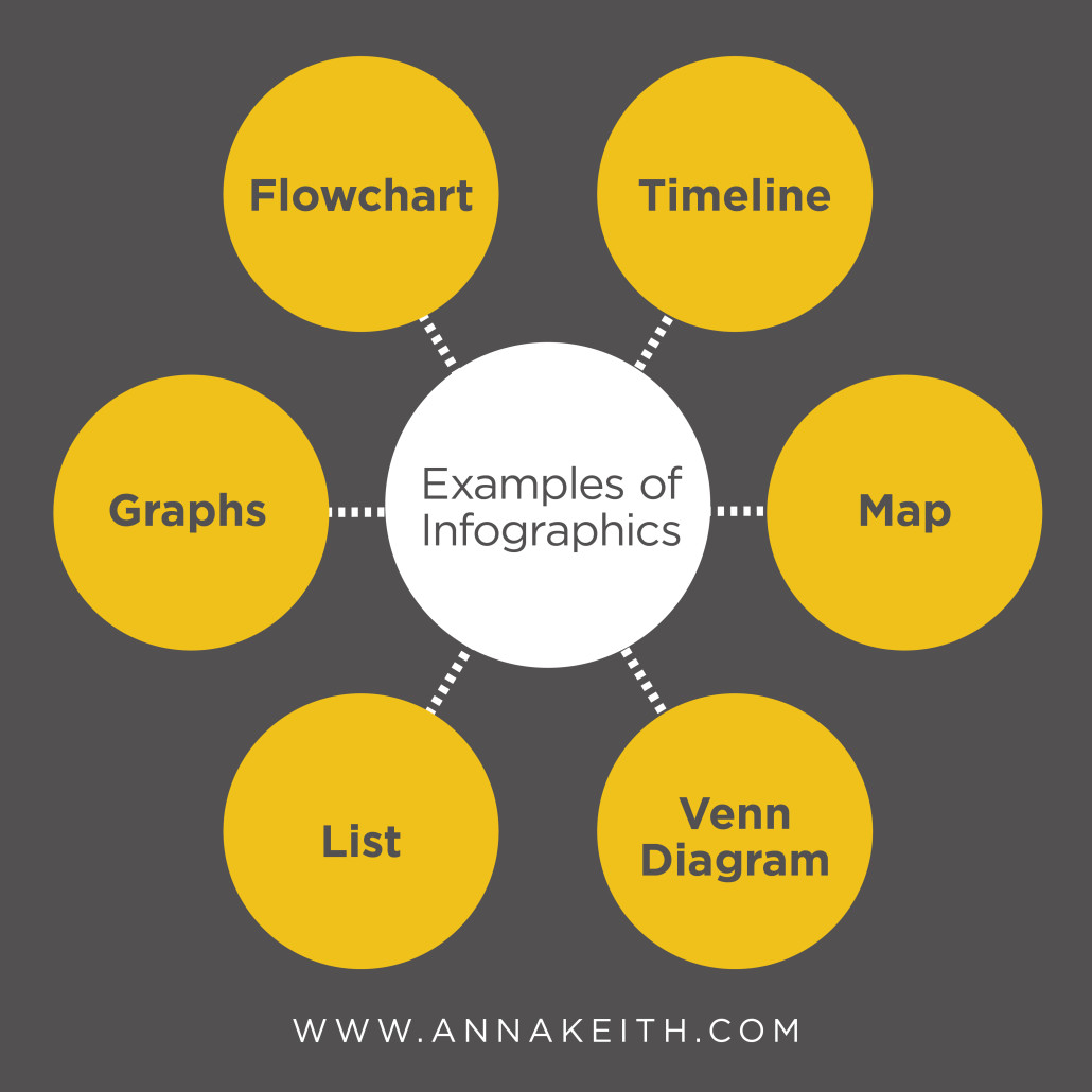
So can your data be an infographic? Yes, the answer is always going to be yes. If you’ve got information to share, you can represent it visually. Here are just a few of the possibilities:

Infographics-01


  • Pie graphs or line graphs are great for when you’ve got numbers, like percentage breakdowns or other growth.
  • A flowchart is often used to answer a question by giving the reader choices.
  • A timeline is used to display chronological data.
  • A map shows locations.
  • A venn diagram or charts shows a comparison.
  • A list can be used for tips or a step-by-step.

Even if your data doesn’t seem to perfectly fit into one of the examples above, you can still present it visually. It’s called a visualized article, and you use combinations of icons, illustrations or images to break and article into easily understood information. Since the brain processes images faster than text, getting your point across ASAP is ideal.

Here are a few infographics I’ve created for clients. If you’d like to work together on an infographic project, send me an email to learn more at anna@annakeith.com.


This slideshow requires JavaScript.

Client work: WUSTL University College

This summer I’ve had the pleasure of working with the University College at Washington University in St. Louis. After using the same agency for years (I’m pretty sure I remember her saying it was upwards of 15 years), there were some staff changes at University College and they decided it was time for a change. So, I’ve teamed up with the new Director of Marketing and Admissions to update some of their marketing pieces. We’re planning to bring some color and energy to their design while also keeping it professional. One of the first projects we’ve just wrapped up was an informational handout and series of charts for transfer students looking to come to University College to finish their degree. You can check them out below, and I’m sure I’ll share some additional WUSTL pieces down the road.

This slideshow requires JavaScript.

Client Work: ZeaVision

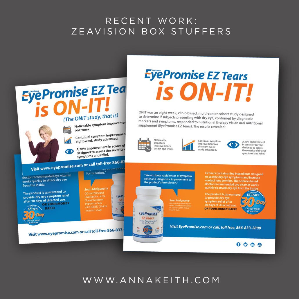
I’ve been working with ZeaVision for a couple months now. The company, based in Chesterfield, works to preserve healthy vision. I’ve helped them out with web banners, postcards, social media graphics, and, as you can see below, some box stuffers to be sent to customers and doctors. The two box stuffers below highlight the results from the ONIT study, which tested the effectiveness of ZeaVision EZ Tears. There was a fair amount the client wanted to communicate, and so we worked to find a way to do so without the design feeling text heavy and boring. The postcard size was sent to consumers and the 8.5×11 size was used with doctors. I’ve got a few other projects underway with ZeaVision now, and I look forwarding to sharing those once they are complete!


Zea-boxstuffers


Client Work: Pi Beta Phi

I was so happy to have the chance to work with the team over at Pi Beta Phi on another issue The Arrow. For this issue, I helped with the cover and a feature story on life lessons. There was a lack of images available and so we took it as an opportunity to bring inographic, and some sidebars with bold colors.

This slideshow requires JavaScript.

2015 Q2 in Review: Fun stuff that happened recently

We’re a few days into 3rd quarter now, and its full on summer here in St. Louis. Looking back, here are a few awesome things about the 2nd quarter of 2015:

  • Kicking off projects with Washington University in St. Louis. I’m teaming up with their University College staff to help them update their branding, and our first couple projects – some print ads at the Muny and online ads on Pandora – are now in market. And lots more to come!
  • Other fun design projects with clients ZeaVision, Pi Beta Phi, Xtra Lease, Doe Run, Sensient, Painting for Peace book, The OASIS Institute, Blank Page Consulting and more.
  • My New York trip! I got to spend time with family and hang out in a city I love. I lived in New York for a couple semesters in college, so it is fun to go back, even if only for a long weekend. There are a few pics over on my Instagram.
  • The discovery of Double Extend Beauty Tubes Mascara. I loving tubing mascara. And until recently I was paying twice as much, so its nice to find a drugstore brand.

It’s been a great couple months, but I’m looking forward to what is to come, starting with a lovely 4th of July weekend! Once we’ve all enjoyed some BBQ and fireworks and are back to work, don’t hesitate to let me know if you need a graphic designer to help you out.